Interior Paint, White Paint
The winning ways of whites.
Usually grouped with other neutrals — black and gray — that don’t have a place on the color wheel, white is not always without color, of sorts. In fact, most whites aren’t pure white.
by Susan M. Brimo-Cox
“Undertones give the off-whites the same character attributed to brighter colors, but just the essence of them,” explains Richardson. So, it’s important to keep that consideration in mind.
Off-whites with undertones of blue, green, violet and neutral gray are cool whites. Those with undertones of red, yellow, orange and neutral beige are warm whites. It is important to look at the elements you’re trying to match or coordinate with, be they furnishings, carpets or window dressings. These elements will help suggest color nuances. “There are much more off-white color possibilities and there is more confusion because of all the other decorating elements. … Key into the existing elements in making your selection,” recommends Richardson. “Even if the carpet is off-white or neutral, it has an undertone, so look there first.” Have your customer point out what furnishing, accent piece or decorative artwork is their favorite, and then identify the dominant color in that item. If the dominant color is warm, use a warm off-white. If it is cool, use a cool shade of white. For the exterior of a home, the same principals apply. Look at the “fixed colors.” What color is the brick, stone, wood or stucco? Use a shade of white that complements the fixed colors, but, remember, whites look a lot brighter and lighter outdoors, especially if used on large surfaces, such as the whole side of the house rather than used as the accent color on doors, shutters and trim.
Preferences in the use of whites are not dramatically different from one region of the United States to another, observes Trent. “The only significant regional differences are related to climate, specifically the intensity of light. As a rule, clean, clear hues are more at home in Sunbelt regions where the sunlight is a constant influence. Those same hues could look less at home in northern climes where skies tend to be grayer with less prevalent sunlight.”
The shade of white selected might depend on whether a stock color, semi-custom or custom mix is desired. “Many contractors may prefer stock colors for their consistency and speed — they do not require the time to mix,” reports Koch. “In terms of consistency, there are a lot of variables in the color tinting process. A contractor wants to know he will get the same results every time. Stock colors help assure consistency.” But, as Lawlor points out, “with custom off-whites, you have infinite variety; with stock colors, touch up is very easy. Look at the customer. [Is it an] apartment complex owner? Easy touch-up might be the priority. The general public customer may want a custom match.” Don’t depend on a manufacturer’s stock colors to give an indication of color trends, however. Typically, stock colors are just the best selling colors. For a better indication of trends, keep up-to-date on the latest color cards and special collection color cards that supplement the main palette.
Painting professionals have a variety of tools they can use to make color recommendations to customers, but, when it comes to whites, some tools might prove to be better than others.
“Sometimes handing a fan deck to a customer is like handing them dynamite — too many choices,” says Ankeney. Color cards, on the other hand, are easier and simpler to use, she explains. “They’re laid out nicely and the customer can go right to what they want.”
Color cards that highlight only whites can be particularly helpful, especially if the various tones of white are grouped. This kind of organization makes the distinctions between the various shades of white more obvious. Depending on the paint manufacturer, color cards may feature large chips that bleed off the page, so the color can be laid directly against the surface to be painted, or the color chips may peel off the color card and be applied to the surface to be painted.
Piontek recommends, “Once the color is selected the next step is to apply a 3-foot square area in the room it will be used. The 3-foot square area is a good representation of what the whole room will look like in the selected color, since light source has a major impact on the final color. Many times a consumer may select a color from a 2-inch by 2-inch sample from a color card, and then it does not meet their expectations when it is applied to all the walls of the room.”
Is sheen important? “Sheen can impact the appearance of color, but has minimal affect on whites and light hues. The choice is made more on the basis of aesthetic preference or possibly for practical reasons such as durability and washability,” observes Trent.
Light reflectance may be more critical, depending on the application, suggests Richardson. “Count on the light reflectance in a given off-white to be more critical than letting your decision based on the gloss level. The light reflectance is the higher priority in achieving the lightness you desire.”
Where pigmented surfaces are concerned, pure white reflects nearly all wavelengths of color; none are preferentially absorbed. So, you might say white is the ultimate color. Nonetheless, white has its fans and detractors. On one hand, it can be perceived as sterile. On the other, off-whites can lend hints and flavors of color without being in-your-face. If there is a lot of light in a room, white may seem too glaring. However, whites can visually enlarge and brighten small, dingy spaces.
While most consumers can be easily confused by whites, shades of white are ideal for many situations and can make effective subtle statements. “White creates a simple elegance and having whites tinted and customized to their home makes [a customer] feel special,” observes Ankeney.
White. It’s not so plain, after all. 
|

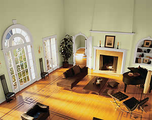
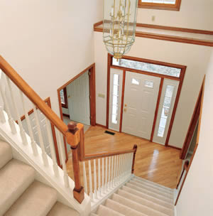 Trying white on for size