 |
|
This project in San Jose, Calif., is a good example of current color trends in the Southwest. The Kelly-Moore colors used are Olive Grove, Autumn’s Bronze, Sheer Exposure and Tortilla Chip.
Photo courtesy of Kelly-Moore
|
2007 Paint Color Trends, Regional Color Schemes
Do different parts of the country have different paint preferences? Warmer, Richer, Natural Environmental and Ethical Influences Help Shape Regional Color Trends in the United States.
by Susan Brimo-Cox
greens and blues, earthy neutrals, and rich, warm ethnic colors.
Ever wonder how color trends like these are identified? It’s not as simple as one might imagine.
Formal organizations, such as the Color Marketing Group, as well as color stylists, senior designers, and color and design directors at major paint manufacturers, put a lot of research and thought into it.
Sara McLean, color marketing manager at Dunn-Edwards Paints, says a myriad of things are looked at and carefully considered: current events, demographics, technology, fashion and entertainment, the global melting pot, and much more.
 |
 |
 |
| Photos courtesy of YOLO Colorhouse |
What does all of that have to do with color? A lot. McLean offers several examples: The upcoming 2008 Olympic Games in Beijing will drive some color trends, including interest in Asian reds. The number of aging baby boomers, the “tween” market, and the recent report that there are now more single people than married people also influence color choices, she says. Fashion and entertainment’s influences are pretty obvious, as are, perhaps, influences from around the globe. Technology influences color in several ways, not only in the technology of how colors are developed and made, but also in how technology is transforming the everyday world we live in — the emotional impact, so to speak.
“Lifestyles are very key to inspiring color uses,” says Lisa Herbert, executive vice president of textile, home and fashion at Pantone Inc. Are we single or married with children? Are we active? Do we travel? Our color choices could be very different if we’re still working versus if we are retired, or for our primary home versus a vacation home, she says.
Often there are variances in color trends regionally. Becky Ralich Spak, senior designer with Sherwin-Williams Co. says geographic location, style of architecture, the surrounding landscape and weather conditions are important factors, especially for exteriors. For example, because of differences in sunlight, the same color is likely to “read” one way in the Southwest and another way in the Northwest.
Doty Horn, director of color and design at Benjamin Moore & Co., agrees that weather helps drive regional color preferences. The further north you are, she says, the cooler the color direction — towards blue and gray — and so color choices can tend to be more conservative. On the other hand, in warmer climates, there is more saturation of color, so there is more use of active and brighter colors.
Colors choices are also based on historical perspective, Ralich Spak explains. That’s why colors that work in Savannah, Ga., are different from those used traditionally in Boston.
Many color trends start on the West Coast. Mary Lawlor, color stylist for California-based Kelly-Moore Paints, says she’s seeing brighter colors being used in interiors and exteriors. “Consumers’ eyes are becoming accustomed to brighter colors and they want to use them in their own homes.”
And the popularity of accent colors is huge, Lawlor says. Homes are being accented by dramatic color these days, and not just on the front door. The colors are being used in interior rooms, for accent walls, and even the entire house. Some new home builders are using accent colors for home exterior body colors.
“On the West Coast, anything earthy and environmental looking is a hot button,” Lawlor says.
In the Pacific Northwest, Janie Lowe, artist and co-founder of Portland, Ore.-based YOLO Colorhouse, sees color moving in two ways. “Sophisticated, cooler hues are gaining popularity — blues and greens — yet tending toward the warmer side of these inherently cool colors. The other trend I see is homeowners embracing the idea of creating an interior palette, using two or three colors within a space.”
 |
| Color swatches courtesy of Sherwin-Williams Co. |
Lowe sees color trends in the Northwest as driven by its creative, entrepreneurial culture and the natural surroundings of mountains, rugged coastline and high desert. “I’m seeing greenish, silvery blues and soft, light greens in the spotlight now. Chocolate brown is making a strong statement as an anchor for this cool color trio, resulting in a fresh contemporary look that works in a modern or traditional home.”
In the Southwest, architecture plays a large role in color selection, McLean says. There is a lot of use of brighter tones this year: orange and lime-tone greens, for example. She also points to the “glamour loft” look, which makes use of luxurious purples and orange for its classic, energetic look.
Neutrals, too, are richer, McLean observes. “Beige tones are more sandy, volcanic and charcoal. Chocolates have red and deep muddy undertones.”
In the South there is gravitation to light greens and blues, too, says Herbert, but they are not necessarily clear, bright greens and blues. “The colors are getting warmer and muted, such as cerulean blue and greens with yellow undertones.”
In other parts of the United States things don’t change much, or quickly.
The Midwest, Horn reports, remains conservative as a rule. In Chicago, however, people can be more adventurous. And Herbert is seeing ocher being used more in interiors in the Midwest.
In the East, traditional styles and historical influences still rule the day. However, metropolitan areas such as New York, Washington, D.C., and Atlanta are more forward-looking.
 |
 |
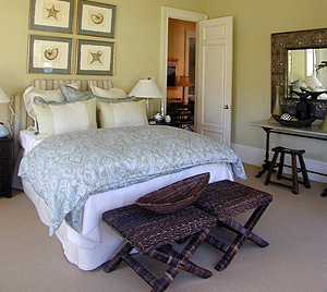
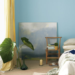
These photos show two colors from Benjamin Moore’s new paint lineup. The top photo is from the traditional Timeless Simplicity Pallette, the paint is called Calming Cream OC-105. The bottom photo shows Scenic Drive 697, an earthy paint color from the Natural Terrain Pallette.
Top photo courtesy of Sherwin-Williams Co.
Bottom courtesy of Benjamin Moore & Co. |
“The irony of regional color preferences is that people from Seattle are moving to Miami and taking their color schemes with them,” Horn says. “And Northeasterners are moving to the Southwest. There is a fusion of colors that is occurring.”
Ralich Spak agrees. For example, as northerners move to Florida, deeper clay tones, deeper golds, browns and darker greens are being used there. “Maybe five years ago these colors were not associated with the Southeast,” she explains.
In a similar fashion, people who travel to faraway places see other cultures and become much more aware of colors associated with those cultures. Currently the rich, warm, vibrant colors of India, China and Hispanic cultures are popular: reds, orange, gold, coppery golds, browns, greens, yellows and purple.
Another general shift is, while people are using more color, there is a return to neutrals, but not the whites and light neutrals of years past. Today’s neutrals have more body and substance. Think chocolate, mocha, camel, and mid-tone grays.
“Colors go in cycles and they have a way of coming back around, but not in the same way as the first time,” Ralich Spak observes. “Even though there is a cycle, there is a shift in how we look at colors.”
A current trend derived from the fashion industry is interest in metallics, pearls and other specialty finishes. Used for contrast, to add elegance or simply to put a spin on neutrals, metallics are hot, especially pale gold and copper.
The ways people are using color is evolving to a more sophisticated approach as well. “Trim colors have changed, for moldings and so forth, moving away from white to the use of tan and khaki,” Herbert says. “It provides a nice contrast and makes wall colors pop in a more sophisticated way.”
In addition, people are not as overwhelmed about combining colors effectively. Lowe says, “People are learning how to use harmonious color combinations throughout their interiors, from room to room. The same goes for exteriors. Homeowners are getting better at choosing three distinct colors that work well together on body, trim and accents, in terms of hue, value and intensity. Gone are the days of just altering the body color while keeping the trim a shade of white and the front door red.”

|

